top of page
Background
The Luminosity team has worked closely with the Bank of West product team to revision the banking app. While I was the first-year master's student, I was also the design team leader with a fast-paced roadmap.
Here, I played a product designer who generated ideas with user insights and marketing strategy.
Intro
This project is to revise the Bank of the West customer application to bring in more Gen-Z and Millennial users.
While we are trying to solve business problems, the key of this project is to meet user needs including different personas.
The tech improvement is to implement Native React so that the product can launch cross devices.


Type of Project
Software Design and Development
My Role
Design Lead
User Research & Testing
Marketing Research
UI/UX Design
Presentation
Tech Support
Native React
Team
Project Manager Technology Architect DevelopUX Designer
I. Stakeholders' Needs & Current Problems
-
Keep the user on app longer
-
Cross-sell products
-
Decrease customer calls
-
Revise the style


-
High customizability
-
A stronger sense of ownership and security
-
Everything display on Home Screen
-
Better tool for budgeting and saving
-
Users want to learn more about investment and saving.
-
Users are not used to a chatbot or AI generated customer service.

-
Simple and Easy navigated app
-
Big buttons and clear interface
-
Less information on the screen
-
Easy to contact representatives
-
Less unnecessary advertisement
II. User Research
9 interviews with Gen-Z and younger users
1 interview to elder user
The needs are conflict in some ways, however, to delivery a holistic application that fits both, first, I take out the overlapped needs. For the conflicted needs, I designed some features to make both of them happy.
III. Competitor Analysis

We compared several popular applications on the marketing and break down the strength and weakness of each competitor.
Here, I created this quadrat graph to vision the product on the finial application market.
We found out that some of the applications like Robinhood has complex visual style that draw attention from users to make emotion-oriented behaviors; some financial software like Tastytrade has simple style with goal-oriented interactions.
We aimed to create the new Bank of West product places towards simple, and goal oriented.
Design Process:
Feature List with New Product Objective
After we find all the insights from users and stakeholders. We list out the feature list, and this was a step we confirm the scope of project with stakeholders and the whole team.
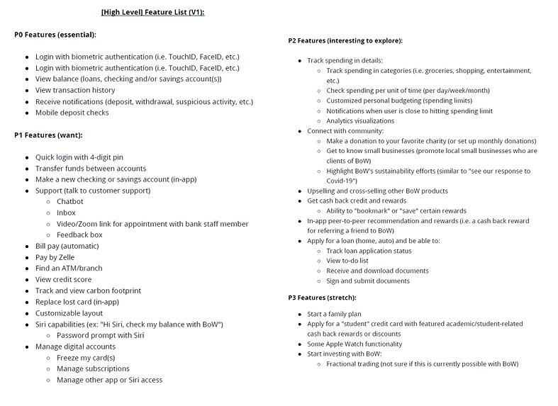
Design Objectives:
1. Efficient
2. Engaging
3. Customizable
Based on the Business and the user needs, we created a full list of features we are planning on integrate for this new product.
This is the foundation of the work scope and the materials for card sorting.
Card-Sorting
We used Miro as our tool for open card-sorting session. I have created two platform for users to create their own app. One is a free canvas, and another one is using phone frame, so that the users can image their banking app.


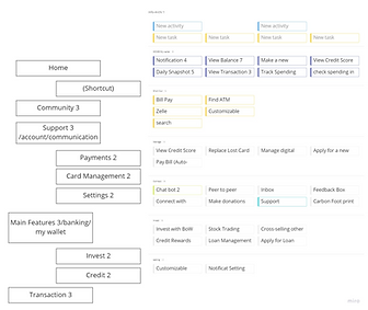
Wireframe and A/B Testing
The card sorting revealed 2 using habits from users, so we decided to run a AB testing.
A: All the information display on the home page. The shortcuts listed at bottom.
B: A application categorized with labels at the navigation bar. Short-cut buttons are floating.

IV. Design and Approaches

Approach 1 - Reorganize the Layout
Redesign the order with card-sorting result by users.
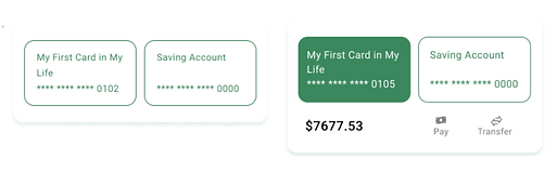
Approach 2 - Customizable View for Balance
Users can choose one the 3 views to check their account balance.
Approach 3 - Credit Score
Younger Users are willing to check their credit score easily.
Approach 4 - Marketing Campaign Cards
Marketing Cards: With the template the marketing team can generate new marketing cards based on the current marketing campaign.
Approach 5 - Customizing Budgeting Feature
Customizing Budgeting and remind users of their use each month.
Approach 6 - Point-Reward Feature
Customers can earn points by explore features and service on the banking app. The points can exchange coupons.
Approach 7 - Shortcut Buttons on the Navigation Bar
Customers can easily access the most used function at the navigation bar for quick access.
New Feature 1 - Budgeting and Gamification
The users cannot find a good budgeting tool for monthly budget and spending management.
We created the budgeting feature by click on the pencil icon, and the monthly spending.
This feature will be supported by Reinforcement learning to categorize the spending items more accurately.
Stakeholders want to improve the engagement and the enjoyment.
Users want to learn more about saving.


The users expressed they had a hard time reviewing the spending history.
This is a reflection game that user can review each spending on one card and swipe "good" and "bad".
The user can establish a better spending habit by playing this reflection game.
New Feature 2 - Point-Reward Feature
The user can earn points by engaging with the app. When users unlock a new feature, they can earn 5 points. When they check their spending more often, they will earn 10 points.
the points can exchange coupons that generated by machine learning modal. By analysis the transaction data, the system will provide the deal or coupon tight to their life activity.

Stakeholders want to improve the engagement and the enjoyment.
Users want to learn more about saving.


How did we design to adapt to younger users
1. We kept the branding language and the size of the buttons
2. We kept the labels with icons which is helpful for older
3. We kept the functions elder generation like: download statement, inbox communication, customer phone call, etc.
Stakeholders want to improve the engagement and the enjoyment.
The Stakeholders want to bring more younger customers
New Product Rundown
To emphasize the new features, I made a animated rundown.
The animated icons can also improve the engagement and enjoyment.
Stakeholders want to improve the engagement, keep the users on app for longer.

The New Design System with Native React
Level 1 - Atoms - Statistic Elements


Level 2 - Molecules - Interactive Components

Level 3- Organisms - Combinations of Elements
Since we are redesigning the app, we changed the design style to more modern, and we added a lot elements and widgets.
I created an Design system to document all the elements used in this product. I chose to use Atom Design Principles to organize them. Another reason of creating a Design System is to help developers implement the elements before crafting the app.
To create the Design System related to the Business, I kept the branding colors, and added animated icons, and vivid style by adding more vibrant colors for the small areas.
To make the App more senior-user friendly, I avoid the all capital on the app, since it will affect the visual and readability.
Insights:
Stakeholders want to improve the engagement and the enjoyment, and they would like to make the app looks more modern to welcome the Gen-Z and new users.
Senior User have hard time to read all Capital, especially "E" and "F", "R" and "P", "I" and "L". When they don't have a reading glasses, they will confused by seeing all cap buttons.
IV.Design Approaches with User and Business Needs
iPhone View
New Feature 1 - Customizable Layout
One of the new feature is to allow user to organize the dashboard as their preference by clicking on the icon on the right corner. By drag and draw the cards, customers can reorganize the app by their preference. They can also click on the to close the card.
This feature can improve the feeling of ownership.
For order users, the default application is intuitive and easy to use as well. They can also click
Stakeholders want to improve the engagement and the enjoyment.
Users want to have stronger sense of ownership.
Elder users can hide the module they are not interested in.

iPad View

Interaction Design on Paper
My favorite part of design process is sketching out the interaction can happen on the app. This help me brainstorming all the posibilities.
.jpg)
.jpg)
Reflection:
This is a project we design and build from scratch. I was acting like a design lead in a team.
I learned that "Leadership is about sharing knowledge to make the executive decisions to push the project." Communicating with the design team and learning about their ideas is very important to push the project forward. Ensuring everyone is on the same page and contributes is the key role of a team lead.I also learned that talk to developers and data scientists is crucial to ensure the success of the features.
bottom of page